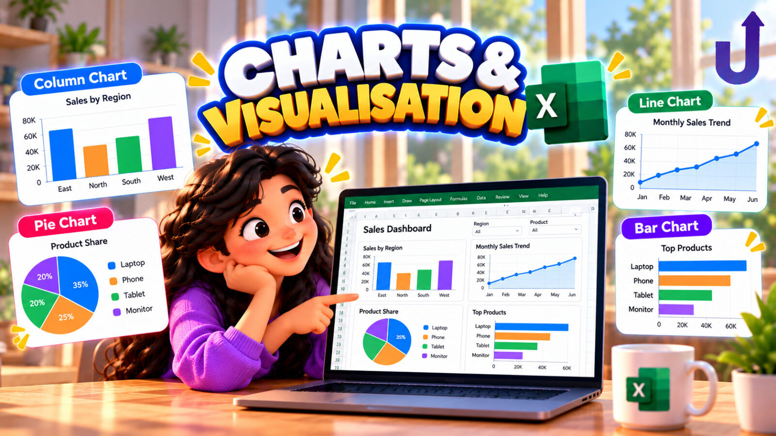
A chart turns a table of numbers into a picture, and Excel builds one the moment you select your data and press a chart button on the Insert tab (Alt + F1 for an instant chart on the sheet). Choosing the right type matters: a column or bar chart compares amounts across categories, a line chart shows a trend over time, and a pie chart shows how a whole splits into parts, and works best with only a few slices that add up to something meaningful.
What trips people up is rarely the chart type. It is the small decisions Excel makes for you when it reads your data: which row is a header, which way the series run, whether a hidden row is drawn, and where the axis starts. This guide checks each one directly. Every result was produced by building the chart, or running the formula, in Microsoft Excel.
In this guide
- The header-row trap: leave the corner cell blank
- Which way the series run
- Hidden and filtered rows are left out
- The value axis does not start at zero automatically
- A pie chart with a negative slice
- A chart only grows by itself when its source is a Table
- Trendlines: SLOPE, INTERCEPT and RSQ
- Common mistakes
- Cheat sheet
- Try it yourself
- FAQ
The short version
- Leave the top-left cell of your data blank before charting. A label there is read as a whole extra series.
- Excel guesses whether your rows or columns are the series, based on which is shorter. Switch it on the Chart Design tab if it guessed wrong.
- Hidden and filtered rows are not plotted by default. Change it under Chart Design, Select Data, Hidden and Empty Cells.
- A chart based on a plain range does not grow when you add a row underneath it. One based on a Table does.
The header-row trap: leave the corner cell blank
Excel decides what is a header by looking at the top-left cell of your selection. If it has text or is empty, that row becomes the category axis. If it has a value, even a normal-looking label like “Product”, Excel treats the entire top row as one more series instead of headings, and worse, it drops the real category labels (the years) and numbers the categories 1, 2, 3 instead:
| A | B | C | D | E | F | |
|---|---|---|---|---|---|---|
| 1 | Product | 2021 | 2022 | 2023 | 3 | |
| 2 | Pen | 10 | 12 | 14 | Product: [2021.0, 2022.0, 2023.0] | |
| 3 | Book | 20 | 18 | 22 | Pen: [10.0, 12.0, 14.0] | |
| 4 | Book: [20.0, 18.0, 22.0] |
Leaving A1 blank fixes both problems at once: two series are created (Pen and Book), and the years become the category axis:
| A | B | C | D | E | F | |
|---|---|---|---|---|---|---|
| 1 | 2021 | 2022 | 2023 | 2 | ||
| 2 | Pen | 10 | 12 | 14 | Pen: [10.0, 12.0, 14.0], x-axis [2021.0, 2022.0, 2023.0] | |
| 3 | Book | 20 | 18 | 22 | Book: [20.0, 18.0, 22.0], x-axis [2021.0, 2022.0, 2023.0] |
The fix: before charting a table that has row labels down the left and column headings across the top, make sure the single cell where the two headings would otherwise meet is empty.
Which way the series run
Excel guesses whether your rows or your columns should become the chart’s series, and the rule is simply whichever is shorter. Three products across four quarters (more columns than rows) makes each product a series:
| A | B | C | D | E | F | G | |
|---|---|---|---|---|---|---|---|
| 1 | Product | Q1 | Q2 | Q3 | Q4 | 3 |
Turn the same idea around, four products across two months, and Excel switches to the other direction, making each month a series instead:
| A | B | C | D | E | |
|---|---|---|---|---|---|
| 1 | Product | Jan | Feb | 2 |
If the automatic choice does not match what you meant to compare, use Chart Design, Switch Row/Column to flip it, rather than rebuilding the chart.
Hidden and filtered rows are left out
By default, a chart skips rows that are hidden (by hand, or by a filter). Category C is hidden in a three-row list:
| A | B | C | D | |
|---|---|---|---|---|
| 1 | Cat | Val | 2 | |
| 2 | A | 1 | 3 | |
| 3 | B | 2 | ||
| 4 | C | 3 |
To include hidden data, use Chart Design, Select Data, Hidden and Empty Cells, and tick “Show data in hidden rows and columns”. This is worth checking whenever a chart looks like it is missing a category: the row is probably just hidden or filtered out, not deleted.
The value axis does not start at zero automatically
Excel’s automatic axis picks a range that fits the data closely, which is efficient but can be misleading: small real differences look enormous. Four scores clustered between 96 and 100 get an axis that starts near 94, not 0:
| A | B | C | D | |
|---|---|---|---|---|
| 1 | Item | Score | 94 | |
| 2 | A | 96 | 101 | |
| 3 | B | 98 | 0 |
Neither choice is universally correct. An axis starting near the data makes small real differences visible; an axis starting at 0 shows the true proportion between values. Pick the one that matches what the chart needs to say, and set it deliberately (right-click the axis, Format Axis, Minimum) rather than leaving it to guesswork, especially if the chart will be shown to someone else.
A pie chart with a negative slice
A pie chart assumes every slice is a positive part of a whole. Excel can still draw one with a negative value, but the arithmetic behind the label is worth knowing: the percentage on each slice is that slice’s value divided by the sum of the absolute values of every slice, not the plain total. With slices of 40, 40 and -20 (which add up to a plain total of 60):
| A | B | C | D | |
|---|---|---|---|---|
| 1 | Cat | Val | 40.00% | |
| 2 | A | 40 | 40.00% | |
| 3 | B | 40 | -20.00% |
The negative slice is drawn with the same size as a positive 20 would be (using its absolute value for the geometry), but its label keeps the minus sign. A pie chart with a negative value nearly always means the data does not suit a pie chart at all; a column chart handles a mix of positive and negative values without this trap.
A chart only grows by itself when its source is a Table
A chart built on a plain cell range remembers that exact range. Type a new row directly under the data and the chart does not notice:
| A | B | C | D | E | F | |
|---|---|---|---|---|---|---|
| 1 | Cat | Val | 4 | |||
| 2 | A | 1 | 4 |
A chart built on an Excel Table (covered in the tables and filtering guide of this series) follows the table as it grows, because the table’s own range grows and the chart is anchored to the table, not to a fixed address:
| A | B | C | D | E | F | |
|---|---|---|---|---|---|---|
| 1 | Cat | Val | 4 | |||
| 2 | A | 1 | 5 |
Trendlines: SLOPE, INTERCEPT and RSQ
Adding a trendline (right-click a series, Add Trendline) draws the straight line that best fits the points. The same line can be described with three ordinary formulas: SLOPE is the line’s steepness, INTERCEPT is its value at x = 0, and RSQ (R-squared) says how well the line fits, from 0 (no relationship) to 1 (a perfect line):
| Formula | Excel shows | Why |
|---|---|---|
| =SLOPE(B1:B5,A1:A5) | 3.9 | each step of x adds about this much to y |
| =INTERCEPT(B1:B5,A1:A5) | 7.5 | the line's value at x = 0 |
| =ROUND(RSQ(B1:B5,A1:A5),4) | 0.9826 | close to 1, so a straight line fits this data well |
| =SLOPE(B1:B5,A1:A5)*6+INTERCEPT(B1:B5,A1:A5) | 30.9 | using the line to predict y at x = 6 |
Tick “Display Equation on chart” and “Display R-squared value on chart” when you add a trendline, and the numbers shown will match these three formulas.
Common mistakes
Mistake 1: a value cell in the corner of the data
As shown above, it turns the intended header row into an extra series and breaks the category axis. Leave that one cell blank.
Mistake 2: assuming the chart updates when you add rows
Only true for a Table-based chart. For a plain range, either rebuild the source with Chart Design, Select Data, or convert the source to a Table first.
Mistake 3: a pie chart with too many slices, or a negative one
Beyond about 5 or 6 slices a pie chart is hard to read; use a bar chart instead. A negative value in a pie chart is a sign the data belongs in a different chart type.
Mistake 4: an axis that exaggerates or hides a difference
Check whether the automatic minimum is appropriate for the point you are making, and set it explicitly rather than leaving it to chance.
Cheat sheet
| Task | How |
|---|---|
| Insert a quick chart | select the data, Alt + F1 (on the sheet) or F11 (new sheet) |
| Avoid the header trap | leave the top-left cell of the selection blank |
| Switch which way series run | Chart Design, Switch Row/Column |
| Include hidden or filtered rows | Chart Design, Select Data, Hidden and Empty Cells |
| Set the axis to start at zero | right-click the axis, Format Axis, Minimum |
| Make a chart grow with new data | base it on an Excel Table, not a plain range |
| Add a trendline | right-click a series, Add Trendline |
| Show the trendline's equation and fit | Add Trendline, tick Display Equation and Display R-squared |
Try it yourself
Work out each answer first, then open the solution.
1. You chart a table with row labels down column A and years across row 1, and cell A1 holds the word Year. How many series does the chart get, and what does the category axis show?
Show solution
One extra series (the whole header row, named Year), and the category axis shows 1, 2, 3 instead of the actual years, because A1 was not blank.
2. A chart is built from 6 products across 3 regions. Which becomes the series by default?
Show solution
The regions (3), since Excel uses whichever dimension is shorter as the series, leaving the 6 products on the category axis.
3. A chart looks like it is missing one category that you know is in the sheet. What is the first thing to check?
Show solution
Whether that row is hidden or filtered out. Charts skip hidden and filtered rows by default; check Chart Design, Select Data, Hidden and Empty Cells.
4. Points (1, 12), (2, 15), (3, 19), (4, 22) and (5, 28) are charted with a trendline. Roughly what does the line predict at x = 6?
Show solution
| Formula | Excel shows |
|---|---|
| =SLOPE(B1:B5,A1:A5) | 3.9 |
| =INTERCEPT(B1:B5,A1:A5) | 7.5 |
| =ROUND(RSQ(B1:B5,A1:A5),4) | 0.9826 |
| =SLOPE(B1:B5,A1:A5)*6+INTERCEPT(B1:B5,A1:A5) | 30.9 |
About 30.9, from SLOPE times 6 plus INTERCEPT.
Frequently asked questions
Why does my chart show the wrong category labels?
The top-left cell of the data you selected probably has a value in it. Excel then treats the whole top row as an extra data series instead of category labels. Leave that one cell blank.
How do I make Excel use my rows as the chart series instead of my columns?
Chart Design, Switch Row/Column. Excel’s automatic guess uses whichever dimension is shorter, which is not always what you meant.
Why is a row missing from my chart?
It is very likely hidden or filtered out. By default, charts skip hidden and filtered rows. Turn this off in Chart Design, Select Data, Hidden and Empty Cells.
Does the vertical axis in an Excel chart always start at zero?
No. Excel automatically picks a minimum close to your smallest value unless you set one yourself, which can make small differences look large. Set it manually in Format Axis when it matters.
Why does a pie chart show a percentage that does not match the plain total?
If any slice is negative, Excel divides each slice by the sum of the absolute values of all the slices, not the plain sum, and the negative slice is drawn as if it were positive, keeping only its label negative.
Why doesn’t my chart update when I add new data below it?
A chart on a plain cell range keeps the exact range it was given. Base the chart on an Excel Table instead, and it will grow automatically as rows are added.
What is a trendline based on?
The straight line that best fits the plotted points, the same line that SLOPE and INTERCEPT describe. RSQ tells you how well that line actually fits the data.
Which chart type should I use?
Columns or bars to compare amounts across categories, a line for a trend over time, and a pie only for a small number of parts that add up to a meaningful whole.
Test yourself
Timed questions on Charts and Visualisation in Excel, with an explanation for every answer.